


1st grade
Jasper Johns name designs, crayon resist (w/watercolor)
This
was one of the first major lessons I did with my 1st graders. I did
name designs with all my students because it was my first year at the
school and it is a great way to learn their names. I might not do name
designs with all my classes next year. I feel like I will remember them
pretty well, and with assigned seating I will easily pick up the names I
have forgotten over the summer. I like the name projects, but their are
so many other awesome things I would like to do with my kiddos and
expose them too.This was a fun and easy lesson for my first
graders. We began the lesson with a simple Power Point on Jasper Johns. I
believe I found one already made on the internet and edited it to suit
my lesson and class. Why reinvent the wheel, right? I love finding and
using other people’s PPTS as my starting point. If they are sharing
them, then it’s out there to use, so I take full advantage of that.After
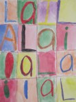
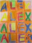
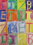
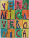
that, students are taught how to fold their paper to create the 16
rectangular spaces. That took up one whole 45 minute block with the PPT
and the paper folding. Make sure they write their name on the back! 😉The
next class I talk to students about warm and cool colors. My kids
barely knew what primary and secondary colors were at this point, so I
just fast tracked it to the complimentary color using warm and cool. We
covered the other stuff later during different in class lessons. Anyway,
after getting a strong understanding of what warm and cool is and sort
of knowing that there is also something called complimentary, students
were show how to fill each box with a letter in their name. I
demonstrated by drawing a rectangular box and talked about how the
letters should touch the top and bottom of the box as well as the sides.
We used all capital letters to reinforce what they were learning in
their classroom, but also because it fills the box more easily. They
used crayons only- no pencils. I also had them grid off the paper first
with any color crayon to make it easier to see the boxes. Insert mini
lesson on horizontal and vertical lines to review what they know about
lines.In creating their letters, after filling the box with them, we talked
about how to “fatten” the letters up to make them real thick. I
emphasized color solid and pressing hard with the crayon so that the
crayon resist technique (which I had not explained to them at this
point) would work.The next step was to paint with
watercolor! Yay! Naturally, I did a demonstration and then had a handout
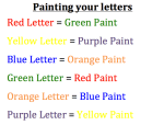
on each table that served as a cheat sheet for what color to paint with
each letter. (See above picture.)I found it interesting
that some of my students were so concerned with not painting on top of
their letters. As carefully as they could, a few of them painted the
spaces all around their letter, making careful movements not to cross
any boarders. Even though they observed my demonstration and knew the
technique would work, they couldn’t have faith in it once they were at
their seats. Overall though, I thought these kids did amazing!
Especially for this being the first year they’ve had art!I
loved this project and will probably still do it, though perhaps using
just the alphabet or numbers. Maybe a positive phrase… I’ll check with
their classroom teachers and see which idea might be most beneficial to
whatever they are learning.
Ms. Grace Face
Glitter lungs and macaroni elbows- an art teacher's issues